
Tank Town Sessions
About the logo
Tank Town Sessions is a collaborative music project set to be held in historic grain silos in the neighborhood in Lockhart, Texas colloquially known as “Tank Town”.
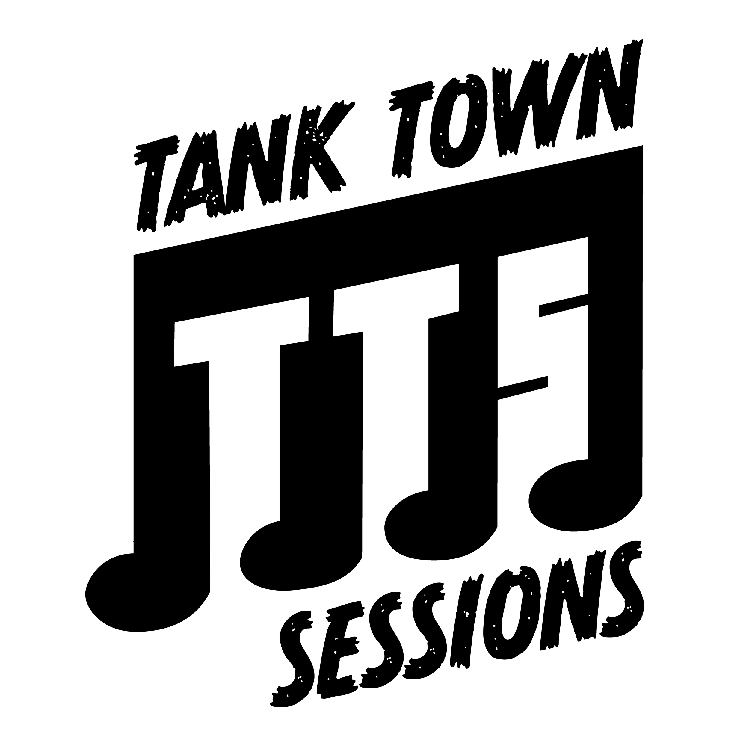
For their logo, we wanted to keep the feeling of a homegrown project - a little grit & grime, with a feeling of excitement. Using a distressed font and TTS in a slight italic in the negative space of music notes, we can create a sense of anticipation. The forms of the letters for TTS also mirror the shapes of the silos themselves, instantly placing the location in peoples’ minds.
The Journey To The Logo
With a number of mockups, I explored the different facets and feels of this projects. While we all loved the idea of the actual tanks being featured in the logo, ultimately it ended up looking too corporate and polished. The client was looking for a more DIY-inspired logo, and the boldness and simplicity of form of the final makes it a snap to include as an overlay or mark in videos and other media.