
Restore National
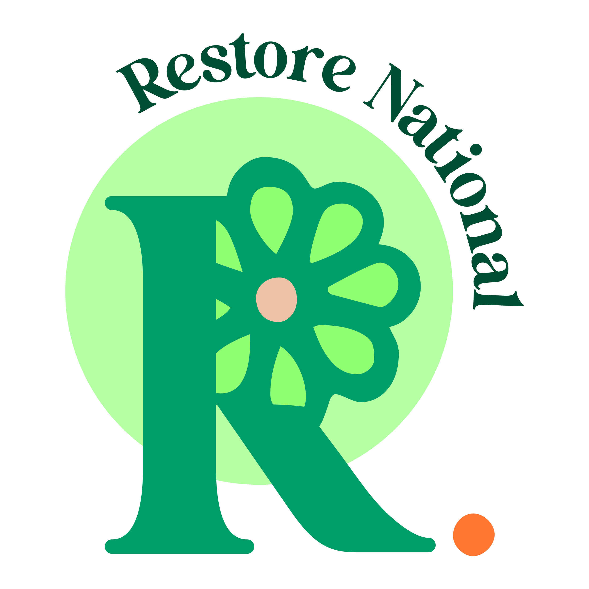
About the logo
Restore National is a nonprofit focused on mutual aid and creating infrastructure to help support Black MaGes (marginalized genders).
Their logo was focused on growing and restoring, as the name suggests, and the client wanted it to be friendly, energetic, and joyful.
With a bright, spring-focused palette and a modified R lettermark, I leaned into the idea of growth and happiness sprouting from unexpected places.
Restore National Alternate Lettermark
Restore National Alternate Logo • Spring Season
The Journey To The Logo
When developing the branding for Restore, I wanted to focus on bright, verdant colors and the idea of growth. Of 3 options I developed for the brand, we discussed and decided that Option 1 felt too “retro”, and Option 2 felt a little too much like a wellness brand, opting for the third option which felt timeless while remaining fun and approachable.
Option 1
Option 2
Option 3